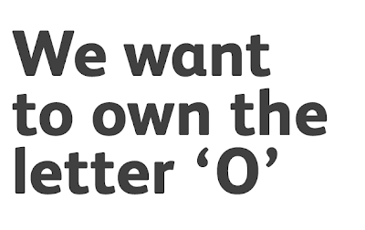
What caught my eye with Peter and Paul was their work for Osmosis where they dedicated the whole campaign around the letter O. As my name is Olivia i rarely find the letter O preferred in typographical idea's. I love the different outcomes this threw up and their use of colour and interesting situations!
From having a look through the website I have found other projects that are not only interesting but are over a range of mediums, including some great interactive pieces.


No comments:
Post a Comment