Saturday 28 November 2009

Boxed Water Is Better


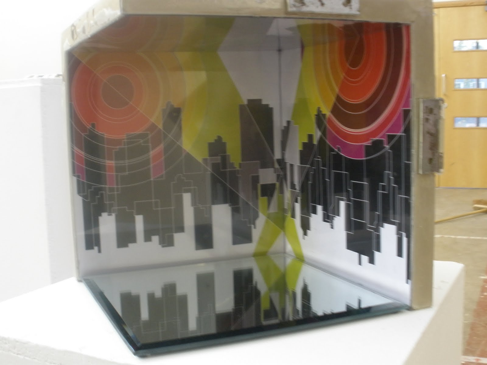
As part of our new project i have been looking at how water affects society, during my research i came across 'boxed water is better' which is part water company part art project. Born out of the simple idea to sell water in a different way thats better cost effective to not only people but society.

Friday 27 November 2009

True North


Today Mike Rigby from True North came and gave us a lecture, he mainly talked through his process of doing Graphic Design at university, to how he got his first job and the journey to where he is today. He began by talking through the structure of a design studio explaining the job roles of Art Director down to Junior Designer, which was great to understand the different authority each post holds. The advice he gave throughout the presentation concerning how to get placements or your first job echoed similar points by our tutors covering the need to be enthusiastic, passionate and willing when around professionals. He spoke about how important it was to take profession and pride with everything that you do and always believe in your own ability as a designer. He gave us a great insight into what to expect to be paid when we start our first job as a junior and the importance of the first few years. After spending 4 years at the Chase he then went traveling round the world spending time in several different countries, he said it was important to allow yourself a break. On his travels he ended up working in Australia and highly recommended working abroad and not to language be a barrier.


Monday 23 November 2009

FINISHED CUBES!!!

My Cube:


Richard's Cube:


Naomi's Cube:

Mike's Cube

Our research door:


Final stages of the cube

I have started collecting the imagery for the inside of my cube and begun to apply them. I have done this by carving the outlines out of thick card to keep it steady. then added sections that prop the images up. I have then staggered them in layers so from the front it looks like one picture but from above the sections are clear.


FabricLive

From looking at the Prodigy cover it reminded me of the Fabric Live albums that also have a pattern of collage and a really illustrative theme throughout each series. Again the use of colour is prominent and the use of photography that runs through each design. 


Always out numbered, never out gunned


The collages that i previously looked at reminded me of the front cover of 'Always outnumbered, Never outgunned' by the Prodigy. I think the way the colour and the different images combine work really well and almost look screen printed. 


Collage examples

I started having a look at some examples of cut and paste collage to get inspiration for how i want the imagery on the inside of my cube to look. I quite like the use of colour and how abstract the image looks as a whole.


New York Illustrations

As we've just come back from new york i remembered an article in an issue of Esopus magazine about illustrations of New York and thought they were quite interesting!


Sunday 22 November 2009

Colour charts

I went to B & Q to look at what blue i wanted the box to be.

Friday 20 November 2009

Thursday 19 November 2009

The Partners


Our final visit to a studio was to The Partners, located next to the Hudson River. The Partners is a large, well known and well credited company initially set up in London, and the most consistently awarded agency as long as it has been running. The company is over 25 years old and is dedicated to strategy and brand communication, a similar wave to Sterling Brands. The New York branch has been running for just over a year and consists of only 4 members. They are a member of WWP which is an organization set up to strengthen marketing communications by having a large client list, which integrates one another in projects and briefs and broadens the ability for work all over the world. www.wwp.com


The presentation we were given echoed similar advice in regards to presenting skills and working with people, however gave us an interesting insight to the difference between English designers and American designers. Stating that English designers use more 'out of the box' thinking and are heavily based on idea's and creativity whereas American designers orientate on a scale that is about profit and making money. This was really interesting as from spending just a few days in New York, it is easy to imagine working over here.

Sterling Brands


Whilst in New York, each pathway had organized visits to attend, the first of our visits was to a Brand agency called Sterling brands, which was situated in the Empire State building. The agency has been going for 10 years and highly revolves around its Global Clients and Global brands. The company prides itself on understanding the needs and requirements of its client and creates long lasting brand design which is relevant to the consumer. The agency is split between two departments: the design team and the strategy team. It was really interesting to learn how each department is run and how they communicate with each other on certain briefs. I felt familiar with the connection between strategy and design as during my time at STEEL i was involved in the same sort of environment with many different departments in continual communication. They showed us many examples of work they had completed and products they had rebranded and redesigned. What was really beneficial was they showed us their starting point and how they arrived at the final idea. Giving us a real flavor of the design process. They also spoke about bringing in freelance illustrators and photographers and the importance of finding the 'right person for the job'


They also gave us some really useful tips, one was echoing advise from STEEL with the use of mood boards and beneficial they are to visually explore different outcomes. Another was to draw from memory a brand or what you understand a product to be, as it allows you to realize what equity your brain recognizes apposed to just your eye. And finally the importance of speaking with confidence about your product or pitch to a client. The notion that if you're not confident, then the client will not feel confident in you're idea, and produce reason and research for idea's to show your thought process and understand.


Bill Viola

While in New York i had the opportunity to visit the Bill Viola exhibition. Multimedia had an organized visit there as part of their pathway itinerary so i tagged along as it's something i was interested in looking at. Bill Viola is one of the leading video artist who's expression through moving image, sound and light has created a new platform for new media and what can be achieved with technology. The exhibition we visited was called 'Bodies of Light' and included many images of people moving in and out of water in an abstract and unsettling way.